At the City of El Paso’s Mexican American Cultural Center, I have had the pleasure to help build the brand’s identity beyond the original logo’s development. The MACC’s logo mark, colors, and type were designed and created by Enrique Avalos, a talented City of El Paso multimedia designer. Upon my entry to the MACC’s team, I was able to begin expanding on that original basic branding identity. The MACC’s visual language was elaborated upon by boldly incorporating the brand colors chosen by the original designer, exemplifying the vibrancy and beauty of colorful Mexican arts, landscapes, and culture. The logotype’s central shape, a heart, was extracted from the mark to be used as a graphic asset in different scenarios. In addition, icons that represent the MACC’s different programming areas were created, inspired by the original logo’s “papel picado” geometry.

Icons from left to right, top row: Culinary Arts, Cultural Events, Media
Icons from left to right, bottom row: Visual Arts, Performing Arts, and Ecology
These icons are utilized as a visual language used for way-finding and signage throughout the interior of the building. They are also used for distinction within internal processes amongst the staff’s organizational methods. (MACC logo mark for reference: designed by Enrique Avalos)
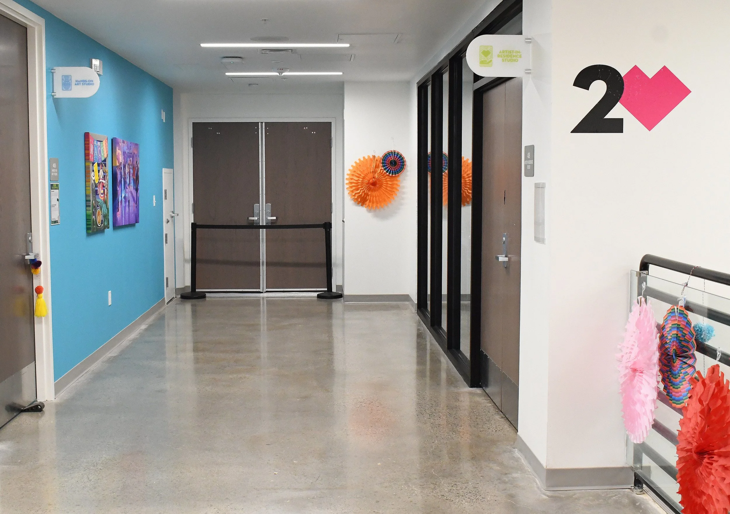
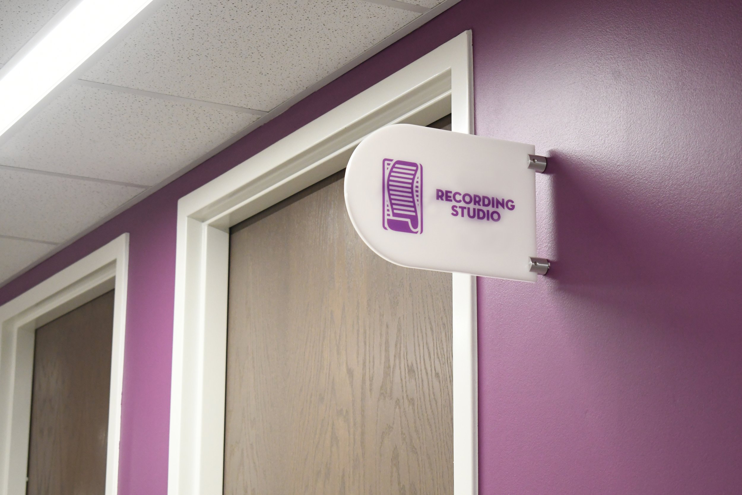
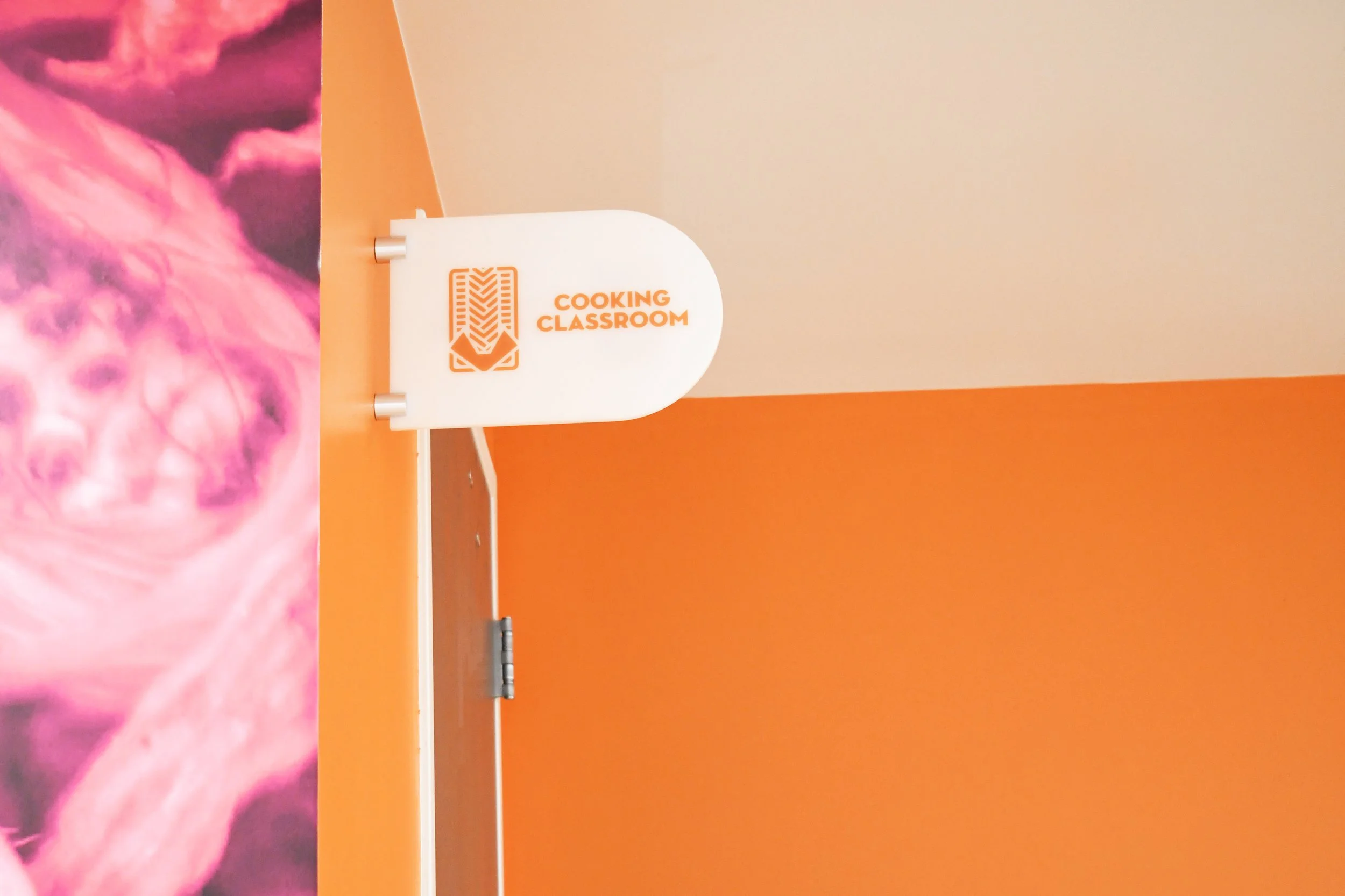
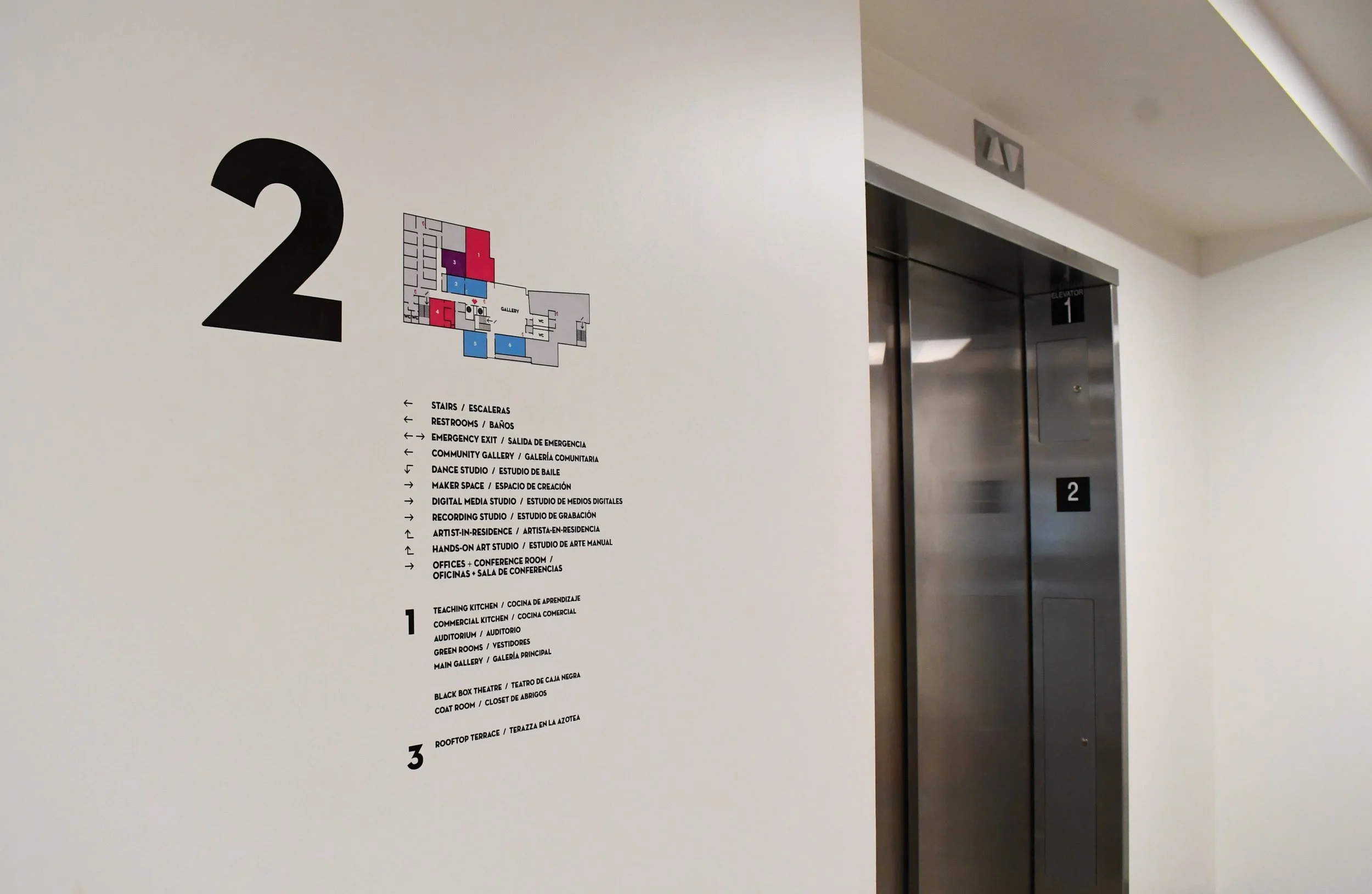
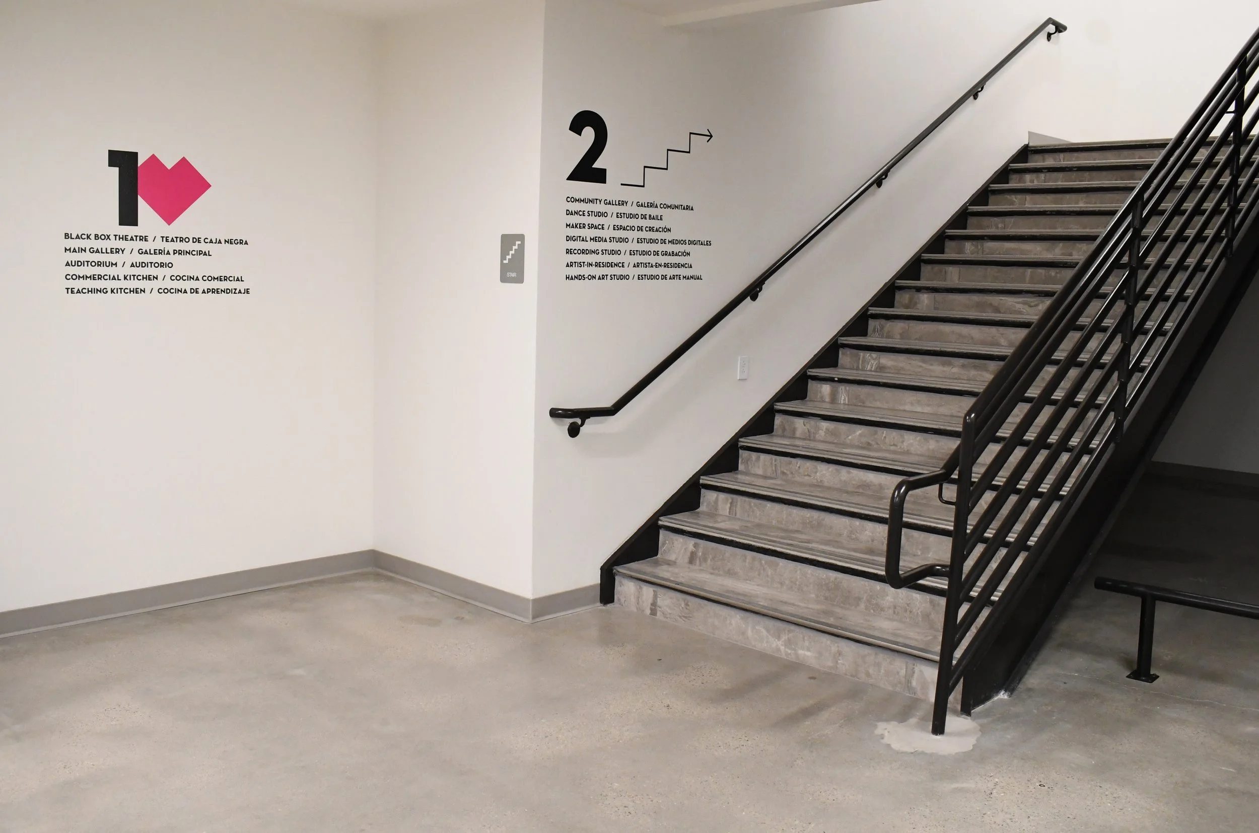
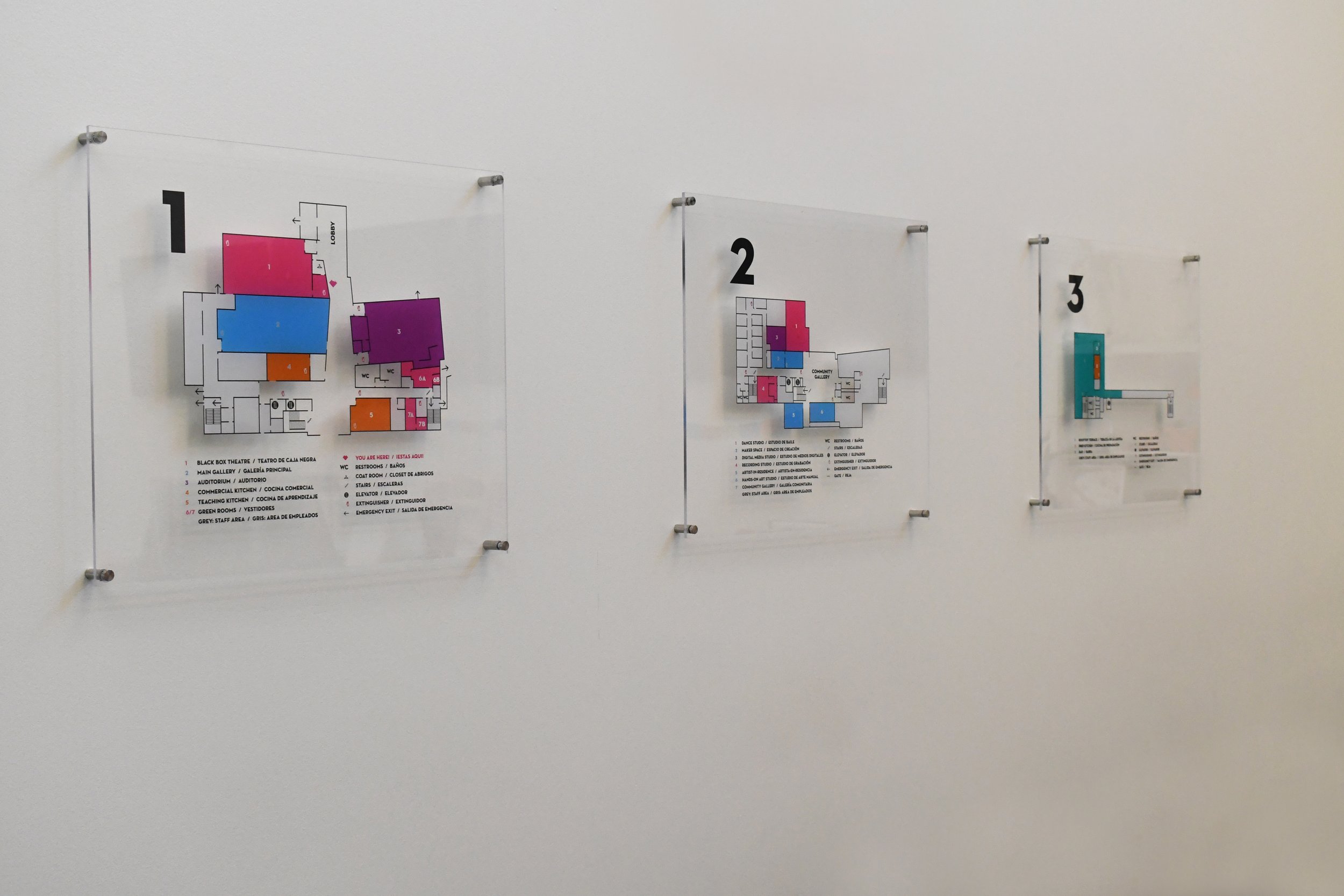
I created the layout for a way-finding system within the facility, determining crucial points of interest amongst staircases, elevators, and certain hallways and corners. I used illustration methods to design the maps that are directly placed on the walls using UV vinyl. At the main lobby by the entrance of the building, the maps also stand on acrylic signs previewing what each floor looks like for incoming guests. (A big shout out to Proper Printshop for helping us bring this vision to life on such a rushed timeline prior to our inaugural weekend!)
I designed our social media visual language, tone and plan so it reflects our versatile yet colorful Mexican-American culture. The goal is to maintain a clean and vibrant approach that still aligns to the original brand developed in 2019, yet evolved to have “come to life” upon our cultural center’s opening. Our approach aims to reflect the beauty of the community members that fill our spaces, as well as the team members that help cultivate the MACC.
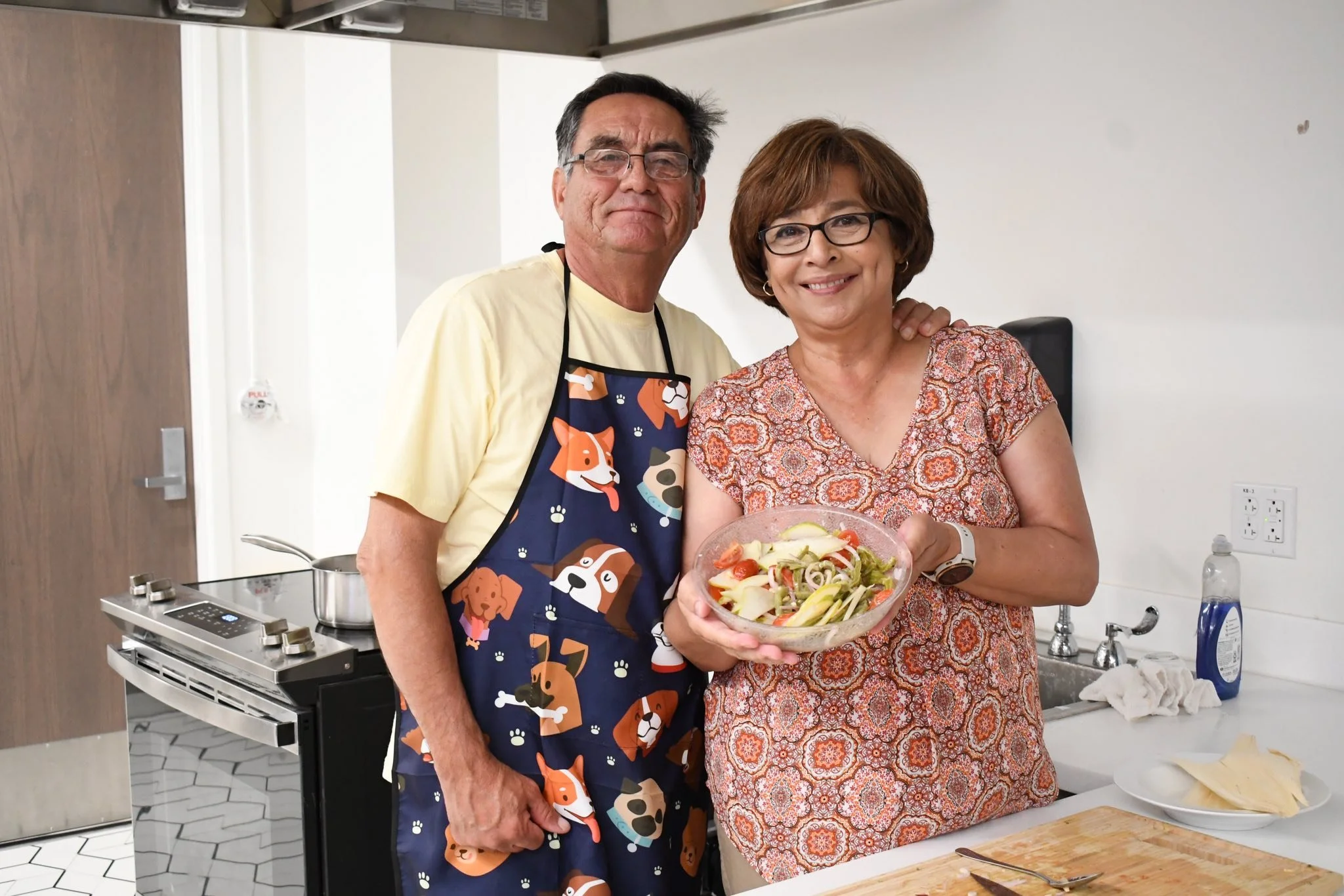
I have the honor of capturing MACC happenings through the camera lens. The photographs included on this page were captured by me.
Above are examples of social marketing campaigns were I have been the lead and creator, like the above Company E movie screening event that filled up to our auditorium’s max capacity. By knowing our audience well, their feelings, and how they relate to current events, a genuine online connection is made, which leads to a growth in numbers as those that our messaging resonates with will share with their online community. This then most likely leads to a real-life connection, where online interactions cause community members to take a step in through the MACC’s entrance. The MACC’s Grand Opening’s save-the-date post is an example of a graphic I drafted to reflect our brand and what our audience likes, which was then further developed by the City of El Paso’s multimedia designer, Enrique Avalos. Together, we collaborated and created a graphic widely shared, causing intrigue and curiosity in our community.

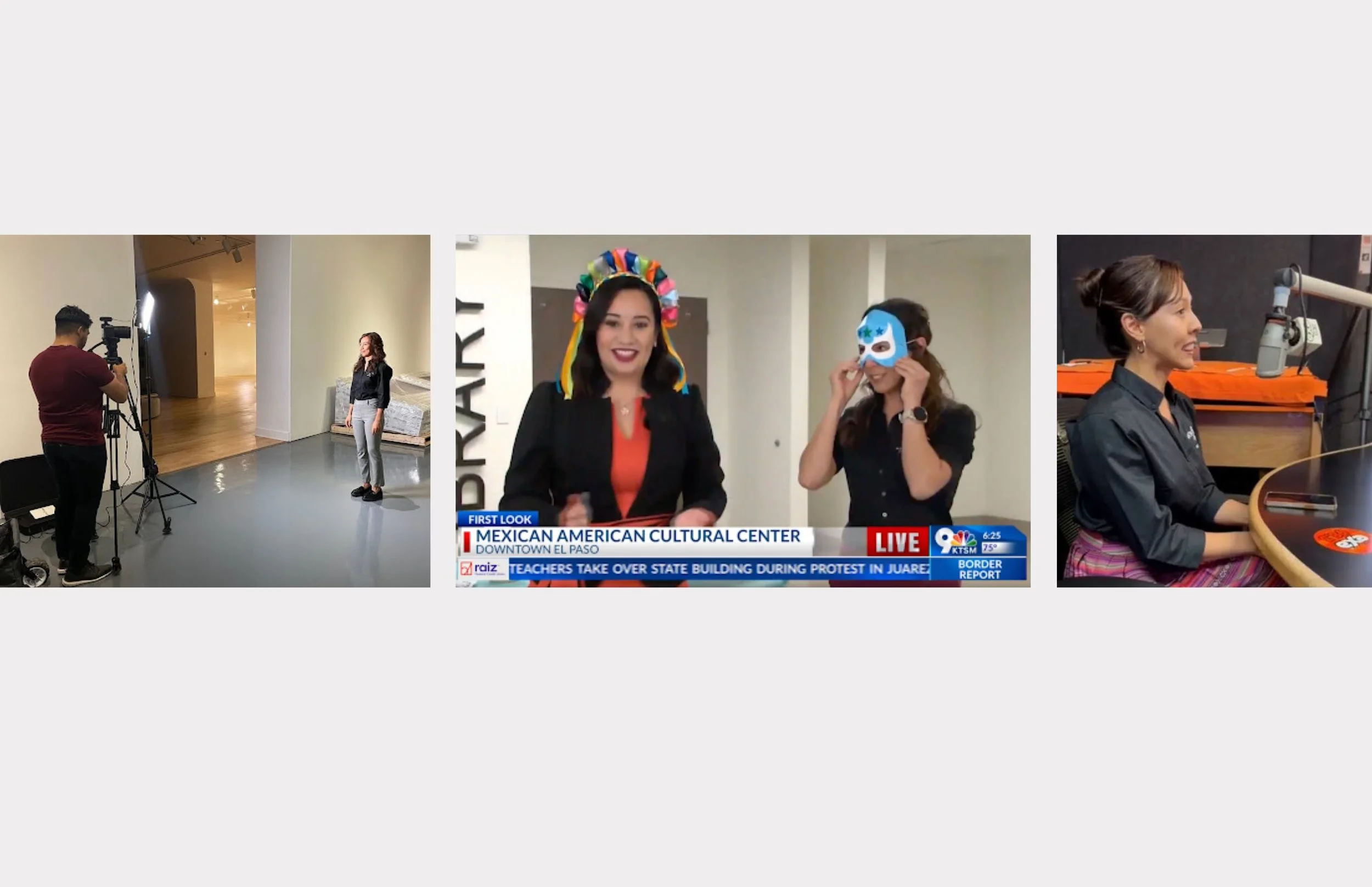
As a part of the communications and marketing initiative of the MACC, one of my responsibilities is to provide interviews for bilingual radio and TV media platforms. I work along with the City’s Public Information Office to ensure that our language and objectives align with our teams’ and events’ missions.
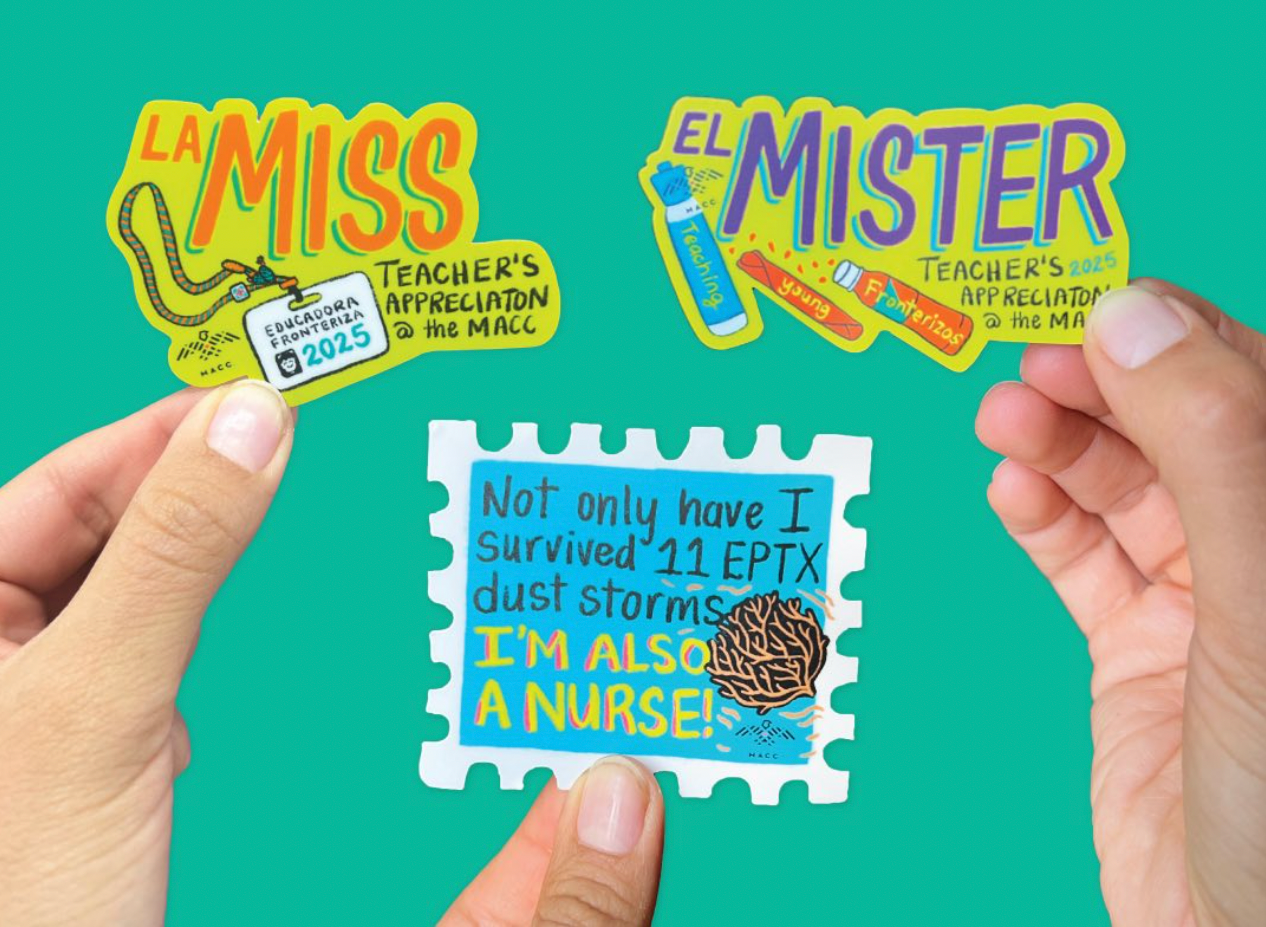
I illustrated stickers to gift to all our educators and nurses during out first spring season.

I am thankful for these frontline professionals - they are the foundation of our community!
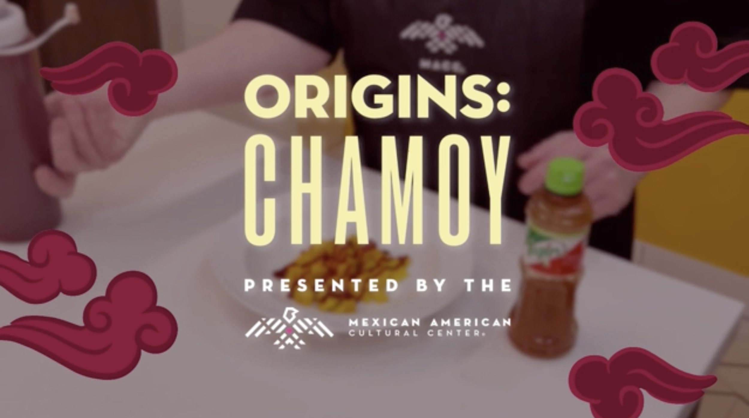
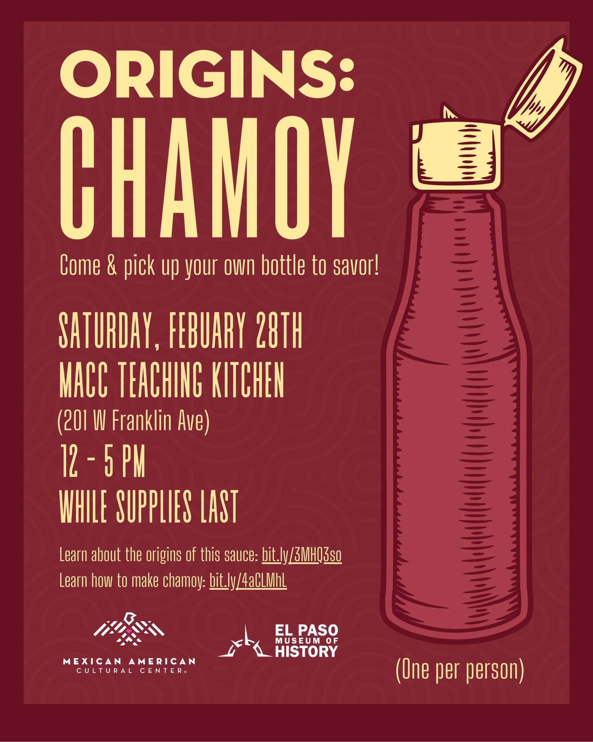
ORIGINS: CHAMOY Marketing Campaign leading up to the macc’s Lunar New Year activation
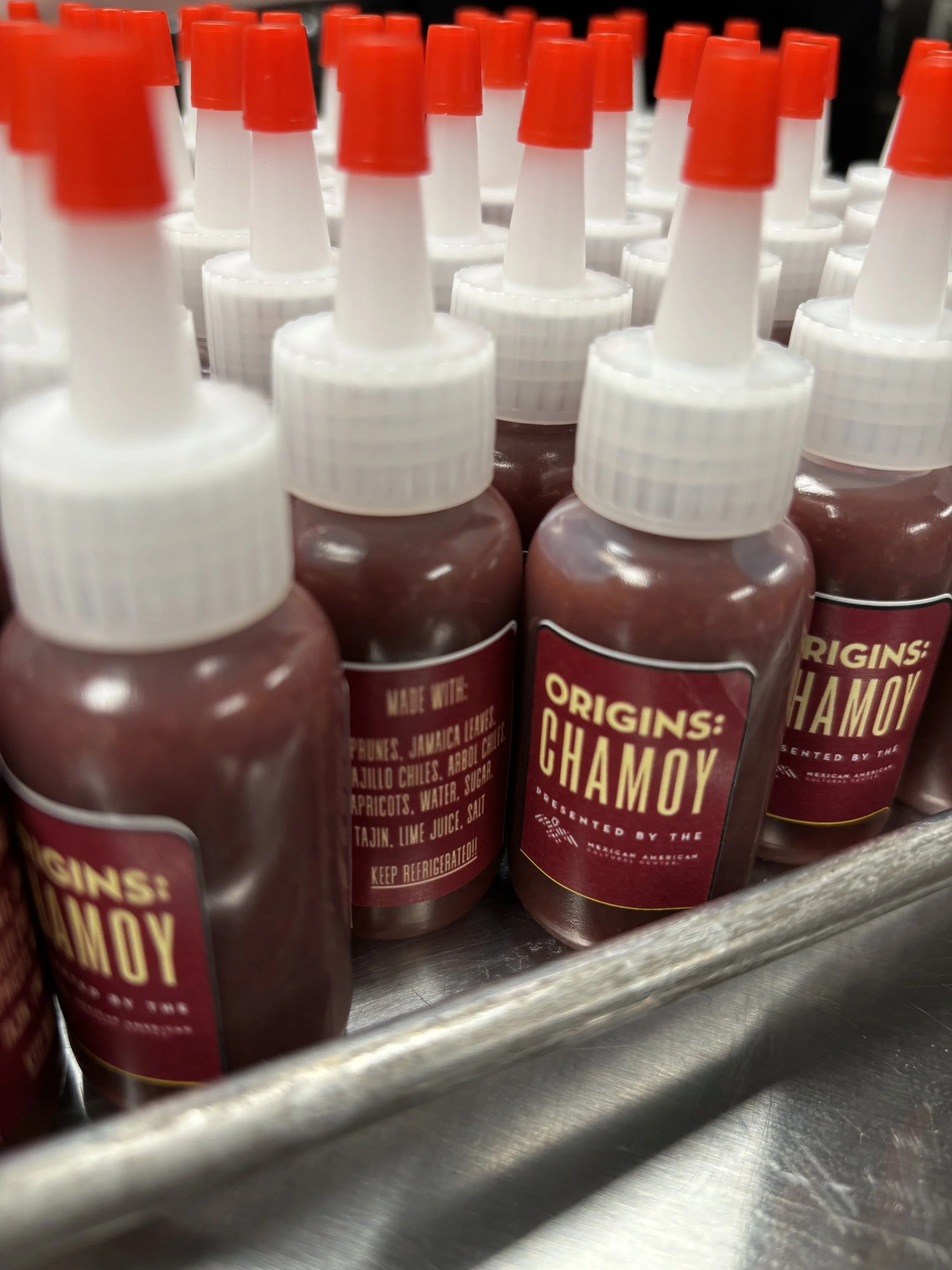
I had been wanting to explore this idea since early 2024, when I was preparing for the MACC’s activation during the department’s Lunar New Year celebration. Through research, I learned that our infamous snacking sauce, chamoy, has origins in China and the Philippines. Given that both are places where the Lunar New Year is celebrated and chamoy is a pillar of Mexican and Mexican-American snacking culture, I thought this was an opportunity we could not miss! Back then, we had a smaller team and our building was not yet open, so bandwidth did not allow to pursue this exploration. However, this year, I was able to lead this campaign and a team of talented and bright team members that helped bring this to life! To start off the exploration, my social media intern, Joaquin, dove into the history of chamoy’s origins in a graphic social media video. The mobile video reached a great size audience! We then created a tutorial video where our culinary program coordinator, Ana, walked us through how to make chamoy in our homes. This production went so smoothly due to a true collaborative spirit, where Joaquin supported with research and script writing, David and Ruben (our audio visual technicians) recorded and edited, and Ana and myself produced from supply-shopping all the way to Ana doing so great as main talent. This completed our online social activations which then led to inviting our community to pick up their own bottle of housemade chamoy sauce during the Lunar New Year event. The 200 bottles sold out in two hours!